Windows 8 is coming. Are you ready?
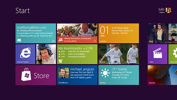
Microsoft debuted its next-generation PC operating system, currently codenamed “Windows 8,” at All Things Digital’s D9 conference yesterday. The company calls the OS a “reimagining of Windows, from the chip to the interface”; the latter was the focus at D9. Above is a screenshot of the brand-new interface at the center of the OS, a touch-based setup composed of “live tiles” — as opposed to mere icons — that takes after Windows Phone 7. A tile can display information, such as a weather forecast or recent tweets, on the “Start screen” (the replacement for the old Start menu) without a user having to open an application.
According to Microsoft, one of the chief design goals with Windows 8 was to create a single scalable operating system that works on devices ranging from small touch-only tablets to laptops or desktop computers with large screens. “It’s ‘no compromise’ and that’s really important to us,” says Steven Sinofsky, president of the Windows team. In this initial demo (which you can view in full here), most of the changes I could see seemed to be geared directly toward touch-centric interfaces. Indeed, Julie Larson-Green, corporate vice president of Windows Experience, explains that “the new user interface is designed and optimized for touch,” while promising that “it works equally well with a mouse and keyboard.”

To that end, Windows 8 is fronted by the touch-centric Start screen, but retains the classic Windows 7-style Desktop and Explorer underneath for existing Windows applications. (Desktop and Explorer have been updated for touch interfaces with “fuzzy hit targeting,” which accounts for the decreased precision offered by a finger as opposed to a mouse.) The OS integrates legacy applications with a new type of program, “Web-connected and Web-powered” apps built in HTML5 and JavaScript, that features heavily in the live tiles. (Note the presence of a large “Store” tile, which all but confirms that Microsoft will sell these apps directly to consumers. I bet you can’t wait to play Angry Birds on your beefy gaming rig.) There’s a rather jarring disconnect between the fancy-pants new Start screen and the old-school Desktop, but I suppose that you can’t just do away with decades of Windows applications (and the familiarity that users have with them).
Just as Windows 7 was able to run on less powerful machines than Windows Vista needed, Windows 8 will have even less stringent system requirements than Windows 7. That’s pretty remarkable in and of itself, but it’s even more impressive when you watch the demo and see just how fast and responsive Windows 8 looks, especially when flicking through applications. It’s worth noting that the Start screen is the most sweeping interface revision that Windows has seen since the jump from Windows 3.1 to Windows 95 over a decade and a half ago. Whether it will be as successful remains to be seen.

Of course, the features that Microsoft showed off yesterday are just a few of the changes coming in Windows 8, and the company is promising a much bigger reveal at its mid-September developer conference, Build. When pressed for a release date, Sinofsky wouldn’t even confirm a 2012 launch, only saying that the OS won’t be out this fall.
I’m assuming most of you aren’t reading this article on a touch-capable PC or tablet, so from what you’ve seen of Windows 8 so far, is it something that you’re immediately apprehensive of, relatively indifferent to, or excited about? Hit the comments and let us know!
Exclusive: Making Sense of Our First Look at Windows 8 [All Things Digital]
Microsoft’s Windows 8 Demo From D9 (Video) [All Things Digital]
Previewing ‘Windows 8’ [Microsoft]
Building “Windows 8” – Video #1 [Microsoft’s YouTube channel]


