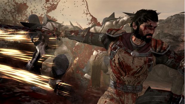
On a wind swept plain stand a brother and a sister. Swords drawn ready to fight off the creatures that are heading towards them waving swords of their own. A swift blow from the brothers axe takes out one and fireball from the sister, a powerful mage, reduces another to pile of red goo. More waves of enemies arrive, the brother makes a gallant vow to keep on fighting until they are defeated. Soon, a giant troll charges into the fray and the duo battle the beast until it is defeated by a devastating spell cast by the sister.
Then we abruptly cut away. “That’s not how it happened”, declares a woman in black. “Well it’s how I remember it” retorts a red haired gentleman. In Dragon Age 2 your story is not your own and Bioware have used this to make some interesting changes.

The flexible reality afforded by this notion has allowed Bioware to deal with a few complaints that were aimed towards Dragon Age: Origins. Firstly, they have taken the opportunity to improve the combat, making it much more immediate and visceral. Gone is the queuing of attacks while you wonder off to make a cup of tea. You can take control of any of the members of your party whilst still issuing commands to the others but you cannot simply relinquish control of the combat to the AI just to play out.
Bioware are also keen to give the world of Dragon Age a more unique visual style, something they are achieving by making everything seem that much more exaggerated. Swords clash in an amazingly loud clang of metal and enemies gush blood when attacked, even being reduced to nothing more than a pair of feet when they are hit with a fireball from a mage.
The conversation wheel is undergoing its first major overhaul since its inception. It’s now the Emotion wheel and with every conversation choice that you have there is a small icon in the wheel to let you know whether it will be good, bad, sarcastic or any number of other variables. Bioware acknowledged that people had found the occasionally ambiguous nature of some of the options to be confusing, causing people to agonize over an option or make the wrong choice all together. The addition of this little visual clue they feel will make things easier on the player.

The PC version is getting a more streamlined UI with Potions having a slot in the bottom right of the screen, characters getting the bottom left and a hot key bar running along the bottom. It is a clean, uncluttered look that leaves players with a much more clearer view of the action.
A lot of this change Bioware puts to listening to the fans on forums. A place where few would dare to tread, Bioware sought out the problems that gamers had with the original and it’s expansion and took note. The result of this is a tighter looking game that will allow the Dragon Age series strengths to flourish.
Prepare to unsheathe your sword in March 2011 when Dragon Age 2 is released for the Xbox 360, PC and PS3.


