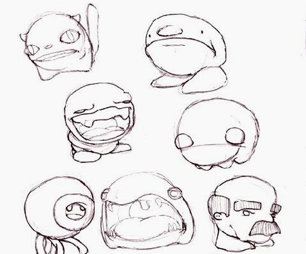
Last week, we gave you an exclusive look at the design process which led to the creation of Tim, the protagonist of the award winning 2D platformer Braid. This week, we’ve got artwork that led to the creation of the game’s enemies. Just like last week, the designs here are by the game’s initial artist, Edmund McMillen, whose work was later altered by the game’s second artist, David Hellman.
Feelings seemed to be mixed about Mr. McMillen’s style versus Mr. Hellman’s when it came to Tim. I have a feeling that the same will be true with these designs, as Edmund’s concepts are for the most part a total departure from what ended up in the final game. Also like last week, I prefer Edmund’s preliminary stuff when it comes to Braid‘s “goombas”. The little lion-headed guys that made it into the final game are great and all, but they don’t compare to the middle-aged man-head above, or some of the severely depressed looking fuzzballs found in the gallery below.
What’s your favorite design here? Do you think any of them beat out what was used in the final version of Braid?
Tune in next week for the final installment of this inside peek at the creation of Braid, and don’t forget to hit the jump for a animated look at these designs in action.


