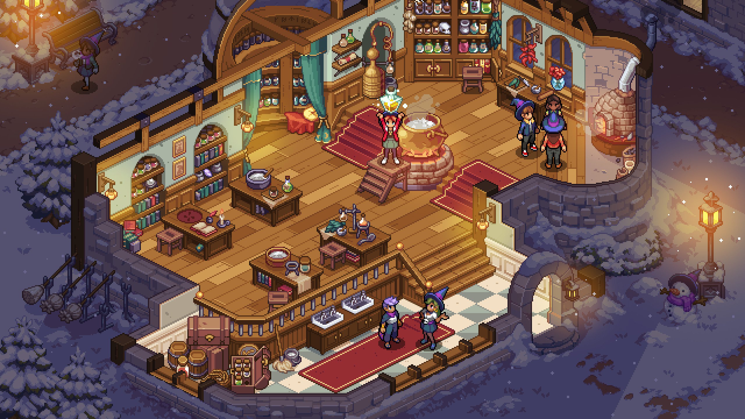
It’s isometric now!
Today, Stardew Valley publisher Chucklefish lifted the lid on an art style overhaul for Witchbrook, its internally-developed magical school simulation game. Before, the studio’s art direction looked super similar to Stardew (which many fans were fine with). Now? It’s taking a much different approach.

As a quick refresher, the game is about a hopeful witch-in-training who’s juggling their time between perfecting spells at magic school and keeping busy with farming/town sim “extracurricular activities” like “fishing, growing magical crops, and foraging strange mushrooms.” There’s a pooch, too.

For comparison, here’s an article featuring the old art style (and the original “Spellbound” name).
What do you think? Do you prefer the original look? I think Witchbrook‘s new style is undeniably an upgrade, but at the same time, it’ll take me a while to adjust to it – especially the camera angle.
We don’t have a release date for Witchbrook yet – or even platforms – but I’m so in.


