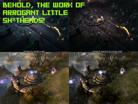
When I first talked about the Diablo “fans” who bitched and whined because Diablo III didn’t look dark enough and had too many colors to fit in with their absurd purist desires, I grimaced and wept at the state of humanity. Now it’s given me something to smile about as developer Jay Wilson has taken the mock-up shots of what whiny “fans” want from Diablo III (obnoxiously claiming they know how the game “should” look) and criticized them, pointing out the unrealistic expectations and bad design choices that these armchair graphic designers have made.
“It becomes really hard to see all the profiles. Look at the tables and see how hard it is to see the profiles of those,” says Wilson of one before-and-after shot that a photoshopper made of a Witch Doctor casting a spell. The so-called fan made the screen very dark and grainy, draining the color from the spell effects. “And one of the things that I actually would argue about something like this is that it’s completely against Diablo II. If you look at the spell effects in Diablo II, they’re very over-the-top. To gray out the actual spell effects, to me it’s pulling out all the vibrancy and interest out of them and really going against a lot of Diablo II philosophy.” Someone just got owned.
If you find the backlash against Diablo III‘s artistic design as ludicrous as I do, then I fully recommend giving this article a look. It’s nice to see a Blizzard professional school these armchair developers who think they know best, despite the fact that they’re unrealistic spoiled brats who would never be happy, whatever Blizzard decided to do.


