It’s 2D in order to maintain the ‘original feel’
Did you forget that a Command & Conquer remaster is on the way? Honestly, I kind of did!
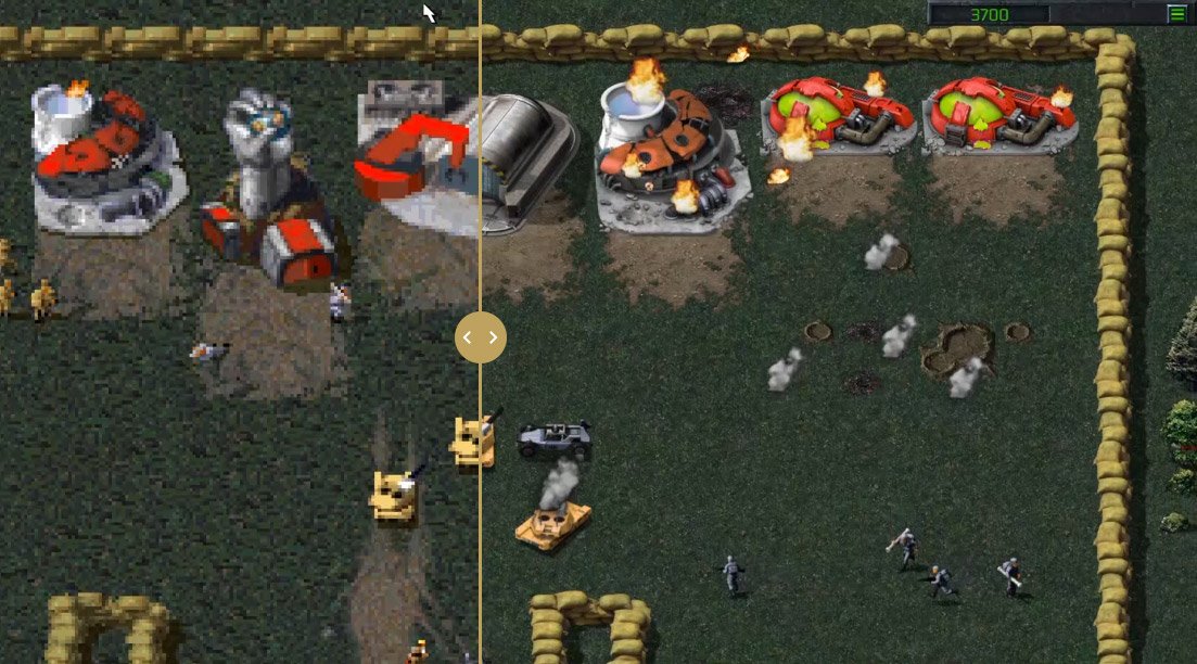
Today, around a year into development, Petroglyph Games and Lemon Sky Studios shared footage of the game, which is striving for a “classic 2D visual style” and the same gameplay from back in the day.
Beyond these comparison shots, you can also see the before-and-after with a slider tool.
 The original Command & Conquer
 The C&C remaster
Some of the assets, like the Tiberium Silo, are “still in progress.”
In the remaster, you’ll be able to toggle between the original 320×200 assets and the remastered 3840×2160 assets in real time. You can zoom in, too, with “an effective zoom distance between the DOS and C&C Gold camera heights,” according to Command & Conquer producer Jim Vessella.
“As you may remember from one of the first posts, our plan is to remaster (not remake) the classic games,” he said. “Creatively, this means our guiding light has always been to remain authentic to the original feel, and we’re constantly on the lookout for ways to achieve that goal. When we recovered the source code to C&C Tiberian Dawn and C&C Red Alert, this gave us a viable avenue to accurately match the core gameplay, feel, and signature look of the legacy titles. We felt the 2D style was the best way to bring all these elements together, and ultimately achieve the authenticity we were looking for.”
This probably isn’t as modern-looking as some fans were expecting, but I understand why they took the approach that they did. If literally anything feels off, that’d defeat the whole purpose of the project.


