I like both!
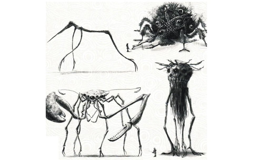
Zelda: Breath of the Wild had a glorious aesthetic to it: bright and vibrant, to the point where even the mechanical aspects of the game felt like they had life. But this concept art from the Master Works 30th Anniversary book are something else entirely, to the point of pure nightmare fuel of Lovecraftian proportions.
Obtained by Gaming Reinvented, the most stunning piece of art showcases the hellish look of the Guardians, but there’s also a ton of other interesting tidbits in there like the interior of Hyrule Castle before the fall, as well as other various facets of the universe and NPCs.
I’m sure a lot of people who are down on Breath of the Wild would have preferred this look, but after really thinking about it — I’m absolutely happy with both. It would be nice to see Nintendo move to a darker tone one day, but they nailed the destruction of Hyrule regardless.
Zelda Breath of the Wild Masterworks Book Reveals Interesting Development Details [Gaming Reinvented]


