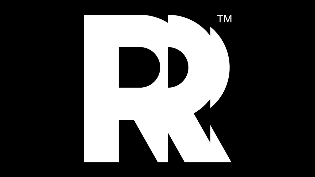
A new look for an evolving studio
Remedy Entertainment is updating its look. After over 20 years of sticking to the same logo, Remedy unveiled its new logo today.
The old Remedy logo, with a bullet in the letter R, was representative of the era of Max Payne, and a different kind of Remedy. But, as communications director Thomas Puha writes in the announcement, Remedy is evolving. And so its logo is evolving, too, to better reflect today’s Remedy.
“The Remedy logo means a lot to us, but we know it also means a lot to you,” Puha said. “Like the games we create at Remedy, we approached this process with great care, consideration and a lot of passion! We want to create memorable worlds, stories, and characters for you to experience through our games. We wanted our new logo to reflect how we constantly evolve and continue creating exciting games with the very best people. However, it’s all still one Remedy where courageous creativity thrives. We hope you like the new look.”
The new logo, seen above, is an R with a bit of a mirrored, staggered look. It does remind me a bit of some of the visual effects from Control, which suits Remedy’s lean into sci-fi storytelling over the years.
A question of identity
It might seem like a little shift, but reading about this today did make me reflect on how Remedy has shifted over the years. The studio started out in 1995, with an eye-shaped logo that infamously prompted a standoff with LucasArts and led to the logo that stuck for two decades.
In the time since, Remedy went from May Payne to Alan Wake, then on to Quantum Break. And now, with the success of 2019’s Control, the studio is planning several spin-offs, as well as a Max Payne remake compilation. There’s even Alan Wake 2 due out this year, a launch target that Remedy reaffirms in today’s news. The studio’s certainly grown a lot, and now it’s got a new look to go with it.


