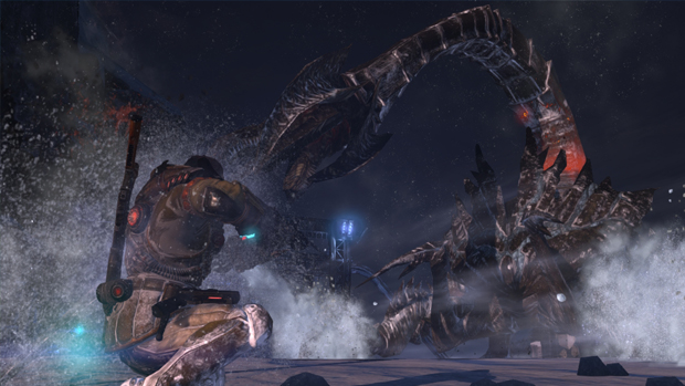
Trade show demos usually go one of two ways: well or very well. Even when a game stinks, the demo is usually put together in such a way that you can’t even tell there is a major problem lying under the surface. Sure, Resident Evil 6‘s E3 demo raised some concerns when I played it and some games didn’t exactly float my boat in press demo form, but I’ve never quite been so frustrated and angry at a trade show demo as I was with Lost Planet 3.
I sincerely hope this game gets its act together before its release. I’m trying my hardest to say this and be the better man, after it kicked me in the shins and called me names.
Lost Planet was never Capcom’s most beloved franchise but at least it was something different. Like Dead Rising, it was an attempt to mimic Western games while not being like any Western game.

Lost Planet 3 may as well go by a different name, because it hardly feels like the first two entries. I’d say it’s like Dead Space but that’s too kind. Red Faction: Armageddon is closer. It’s a third-person shooter as generic as they come: Cover-based shooting, space aliens, push left stick to run, etc.
With such a safe approach, you’d expect developer Spark Unlimited (Legendary, Yaiba Ninja Gaiden Z) to get the little details right, but the game just doesn’t cut the mustard. There are so many perplexing design issues, such as the same enemies you are fighting are also present in the background of the stage as a visual flourish. It reminds me of those D-grade platformers on the Nintendo where you couldn’t tell what was a platform you could jump on from what was part of the background. Instead of shooting what was in front of me, I’d have to use my crosshair as a real enemy detector, waiting for it to turn red so I can shoot.
Even worse is the QTE of doom that I repeatedly died at during the demo. Because it’s not bad enough to throw a life-or-death QTE at the player, Spark Unlimited somehow found a way to make it worse with a baffling prompt that requires you to push the left thumbstick in a specific direction and press A. Except you also have to occasionally hammer the A button, and the game is very specific with how you direct the stick, which makes these QTEs very easy to misread and fail. Usually I give QTEs a pass, but this one really rubbed me the wrong way. I eventually gave up on the game because of this.

All while I was getting frustrated at this part, the guy beside me was complaining about a mech section where he couldn’t find the enemy on the screen despite the HUD directing him toward a spot where it should be. It’s hard to fine a saving grace for Lost Planet 3. It even looks bad with a main character model that is somehow worse than those in the previous games.
I’m not a die-hard Lost Planet fan, but even I am sad to see Capcom phone it in with this sequel. Much like Resident Evil 6, it feels like the company is losing faith in what made the series special and is taking influence from the right games in the wrong way. Except Resident Evil 6 at least looks great and has grander ambitions than being a third-person shooter in space that is hard to pick out from a crowd of similar titles.
Maybe the game will shape up to become something greater in months to come, but it certainly has a long way to go.


