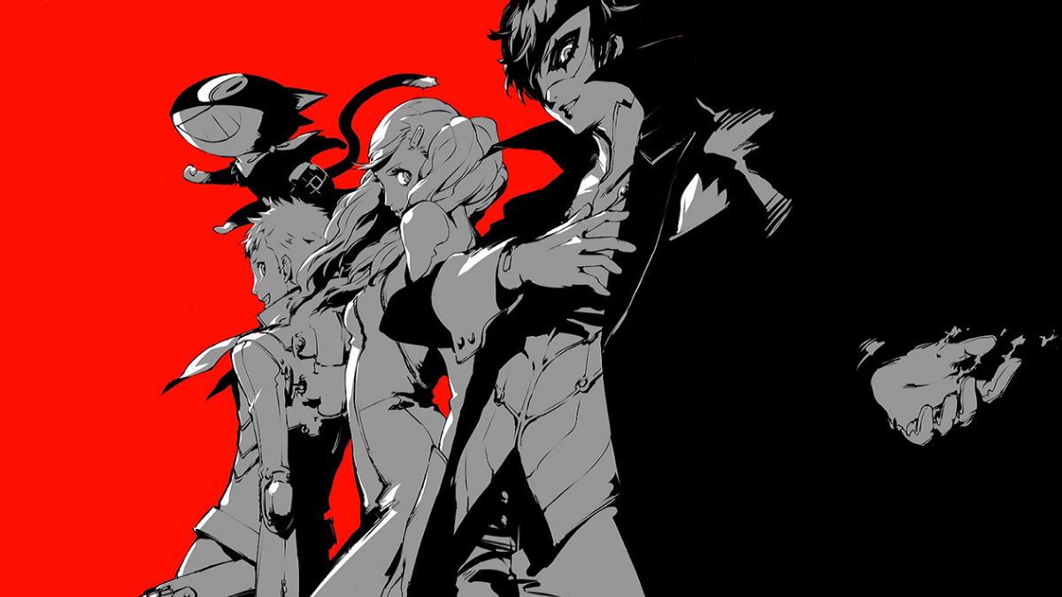
The best menu screens in games can be articulated in many ways, just like the sheer amount of options you can get from the feature itself. In my mind, they’re determined by the music, the visuals, and how unique they can be. You don’t want to see a bland introduction to a magnificent game. Here are the top 10 best main menu screens in games, ranked.
Before we start, I have some honorable mentions. While it’s too soon to rank this alongside long-standing greats, Sea of Stars‘ main menu screen is an impressive introduction to its world. The flickering of the flames reflecting on the pixel-based characters, and the gorgeous backdrop is absolutely stunning. Additionally, Rayman 2: The Great Escape‘s menu features strange, yet enticing music with a view of the world we’re about to explore. There’s also a cute teensie on the left side, welcoming you to the game with its hat.
10. Super Metroid
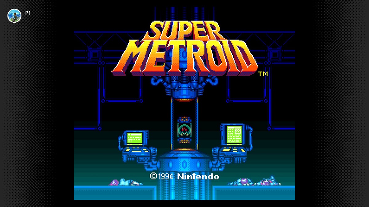
During the SNES era, gamers weren’t anticipating a cinematic introduction to the game. However, Super Metroid features tense music and neat transitions of scenes that feature the creepy sci-fi world of the game. It then reveals a Metroid trapped within a pipe with the machinery flickering in green light. It’s genuinely creepy to see fallen bodies next to the machine as well. It’s a perfect introduction to this game.
9. Psychonauts
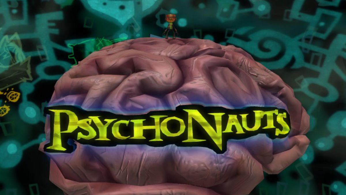
Double Fine is a developer known for its wild worlds, game concepts, and characters. This menu follows that same idea. One of the strangest (and coolest) is in Psychonauts, in which you’re Raz running around a brain. The concept of the game is that you’re trying to fix the issues of a person by infiltrating their mind. It’s a clever main menu concept for a game like this and is certainly unique. I also love Double Fine’s record-based main menu design in Brutal Legend, but Psychonauts just edges it out.
8. L.A. Noire
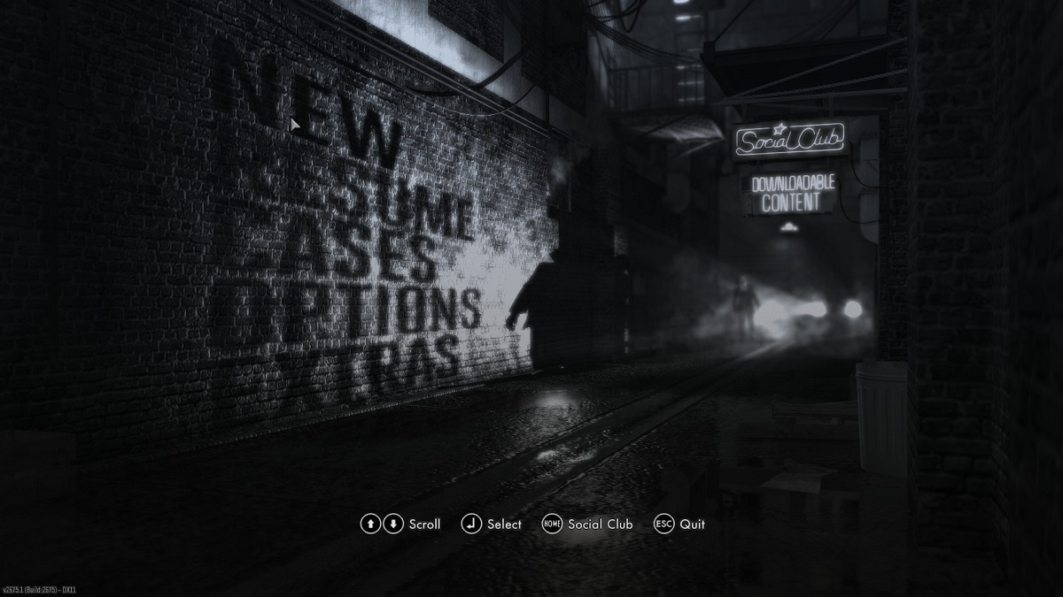
This may be a controversial pick, but L.A. Noire has a unique menu design that complements the subject matter. You get the old-fashioned black-and-white styling mixed in with a shadowy figure of the text. The light shone from the car gives a wonderful effect on the brick wall, adding to the atmosphere of the scene. While it can be annoying to have a gentleman walking in and out of the menu, it’s certainly an interesting take on this classic gaming feature that we haven’t seen before.
7. The Elder Scrolls V: Skyrim
Yes, this is a simplistic menu for such a huge RPG like Starfield, but it more than makes up for it with the theme alone. You hear a majestic choir and triumphant orchestra calling to you. It gets you pumped for the adventure you’re about to have. The logo also looks iconic amongst the white mist and the black background.
6. Pokemon Red & Blue
Despite the limited power of the Game Boy, Pokemon Red & Blue still had amazing intros and menus. You see two Pokemon fighting it out in the intro underscored by a memorable theme song. It then constantly switches between the different Pocket Monsters you’ll find in the game like Snorlax, Mankey, and Ditto. It’s simple but “super effective”at introducing us to the world of Pokemon.
5. Xenoblade Chronicles
The Xenoblade Chronicles title screen is super simple. You see the Monado sword stuck in the ground all by itself. However, the beauty of the world surrounds us as day turns to night. You also see the shine of the metal blade against the sunlight, which is a nice touch. The Monado also glows in the dark as the stars shine brightly above. The emotional music is engrossing as you simply stare at this stunning scene. This is one of the best main menu screens just from how stunning it is.
4. The Legend of Zelda: Twilight Princess
I know, many say that Ocarina of Time‘s menu screen is better, but the one from The Legend of Zelda: Twilight Princess holds more prestige for me. You see Link riding Epona valiantly across the Bridge of Eldin and the wilderness of Hyrule. In the background is a somewhat creepy choir singing the main theme of the game. Then, the intro transitions to Wolf Link who howls to a strange golden wall in the distance.
You also have a hint of the “Midna’s Theme” from the music, hinting at how prevalent your partner will be in the plot and gameplay. You’re then left with a feeling of dread as you only have the sound of wind to keep you company. It’s a brilliant main menu that pulls you into the intended darker atmosphere of the game.
3. Kingdom Hearts 2
Possibly with the prettiest main menu theme ever “Dearly Beloved,” Kingdom Hearts 2 has one of the best intros in gaming history. The credits roll and the music begins to build up. As you begin to see Sora emerge into the title screen, you hear the harp play and the bass strings refer to the protagonist.
It sounds like an orchestra prepping to play before a concert occurs. It then calms down for a brief second until the full menu appears. Then, the piano begins to play the main melody, and each wonderful instrument of the piece blends together in a truly “beloved” way.
Seeped with the sound of waves from Sora’s home world Destiny Islands, you remember where the end goal lies. The blue streak to the right also has a wave-like gradient to it. I just noticed this as I was writing, but the color of the streak goes from navy to turquoise to yellow like a beach. Neat!
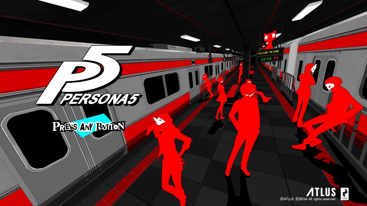
2. Persona 5
Persona 5 has so much style behind its UI and graphical ingenuity. However, the main menu stands out as well. The introduction of the train pop art and then the Phantom Thieves at a stop is fantastic. I love the striking red and white style as you see the trains beside them rush on either side.
The music gives you the depiction that this is going to be a cool, suave adventure. When Futaba gets off her seat, you’ll see a graffiti mark on her seat. It also shows Haru in the back, showing her more shy side.
Personally, I prefer the calmer nature of this scene to the more energetic Persona 5 Royal‘s, but it’s a personal taste, for sure. It gives a more underground feel that matches the Phantom Thieves better.
1. Mega Man 2
Admittedly, I haven’t grown up during the NES era, but my goodness, this is one of the greatest main menu screens in a game, bar none. You start with an overview of the city with a brief summary of the story. The music begins slow and pleasant, but as the camera moves up the skyscraper, the music gets faster until you get one of the most badass menu themes ever. You can’t help but get hyped.
You see Megaman’s hair waving in the air as he readies himself for his tough adventure. When you choose a selection, he then teleports away. Despite having better technology today, this main menu still stands as one of the most epic. Let’s set out and defeat each of the bosses (or at least hope we can). This is one of the best main menu screens ever just due to the excitement I get every time I boot it up.
