Those are a sacred gift
I have a deep fondness for the Castlevania series. The original title is among my favorite games on the NES, the Metroid-style detour kept me addicted for weeks when I collected them all together, and I have plumbed the series’ highs and lows. For such a long series, a surprisingly high percentage are gravy, but then you come across the odd entry that is still gravy, but it’s really old gravy that has been left out.
And maybe the worst isn’t 2008’s Castlevania Judgment for the Wii, but it might be the most offensive. I can completely dig a Castlevania fighting game; there’s been a great cast of heroes and villains to draw from. It’s just then they slap on a veneer of old gravy and you’re left wondering if it’s still worth breaking out the spoon.
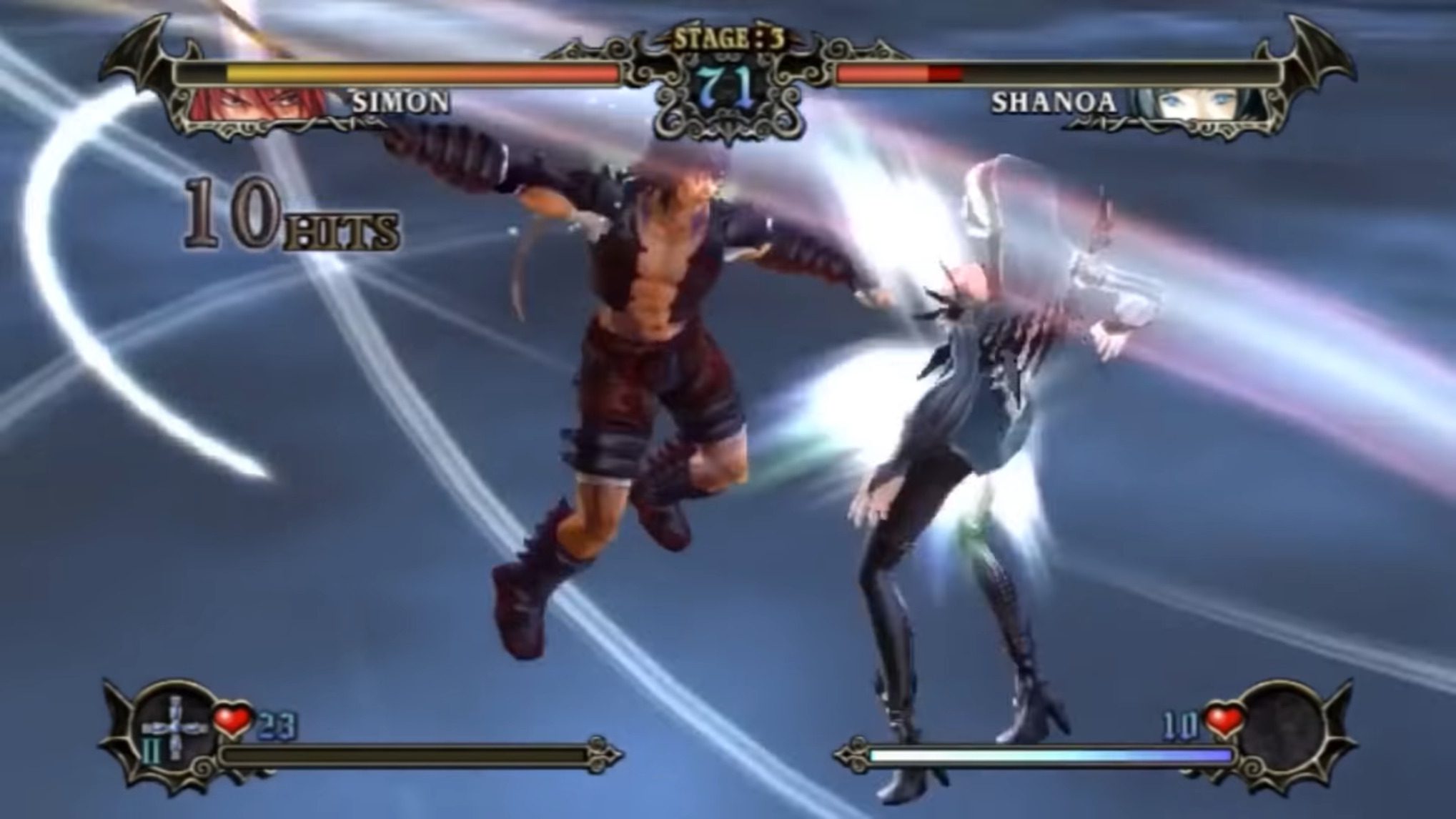
Oh, geez. It’s hard to know where to start with Castlevania Judgment. I really want to dive into why the game is just plain bonkers, but I think it’s best if I just give a sterile rundown of what it is.
Galamoth, who I actually needed to look up, wants to defeat Dracula by pulling some dirty time pool, but this guy shows up and pulls all these disparate heroes (and villains?) into a time rift to make them fight to see who gets to destroy the Time Reaper. I know what you’re thinking, but name a fighting game that doesn’t have a completely ludicrous plot that makes little sense. The only thing impressive is that Castlevania Judgment got here on the very first game, whereas most just ease into insanity by starting with a tournament.
The cast is made from recognizable characters with their wardrobes and personalities thrown into a blender. For example, Eric Lecarde is here, but he’s a child for some reason. Simon Belmont wears bondage gear. Trevor, Sypha, Alucard, and Grant reunite from Castlevania III, but for some reason, Grant is Voldo now.
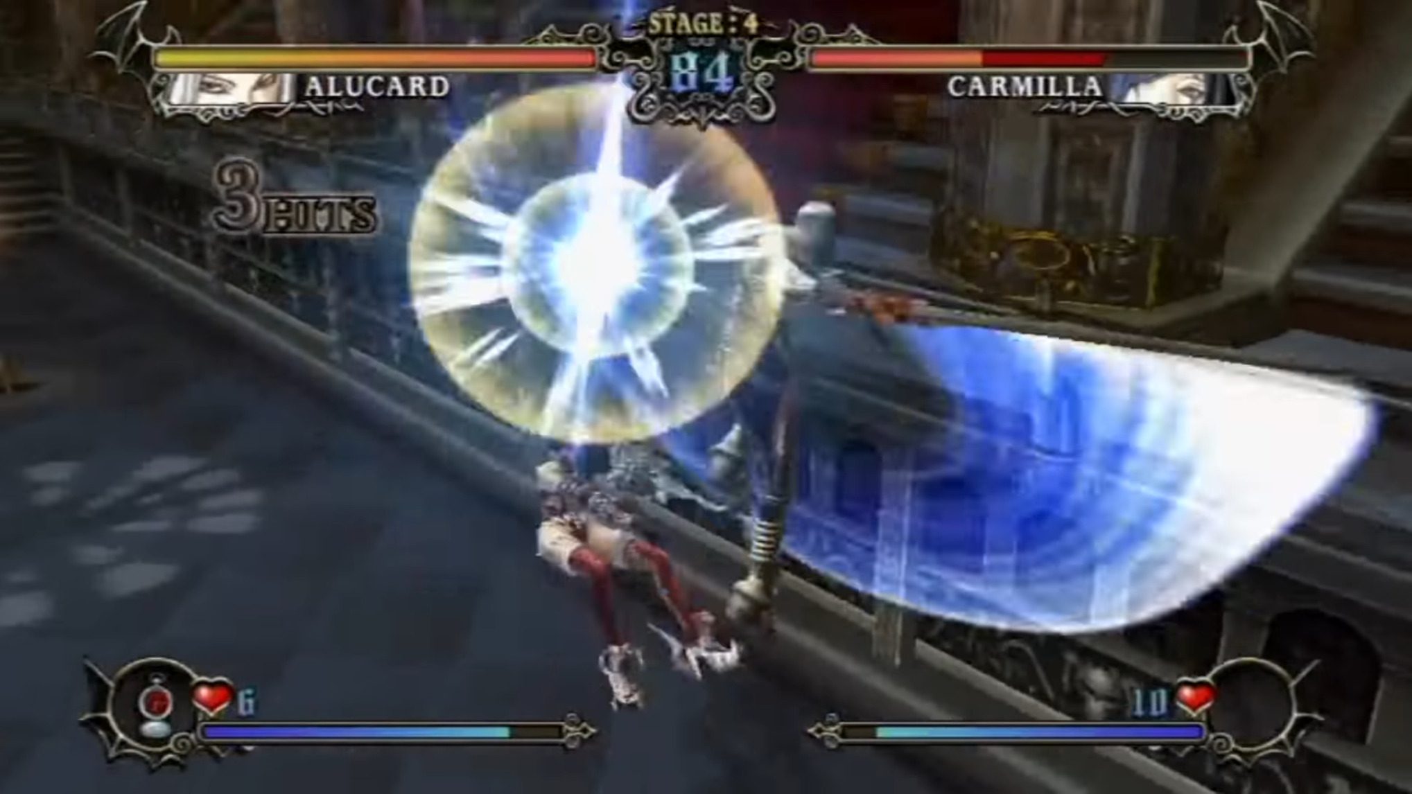
So, let’s tackle the characters because it’s really the focal point. It’s the axis of this decrepit centrifuge.
Since Castlevania: Symphony of the Night, the series had a good thing going art-wise, with the aid of Ayami Kojima. Her art had a bit more beauty to it than I came to expect from playing earlier games. But if that was divergent from what I expected from earlier graphics, Castlevania Judgment is so far off, it isn’t even hanging in the same gallery.
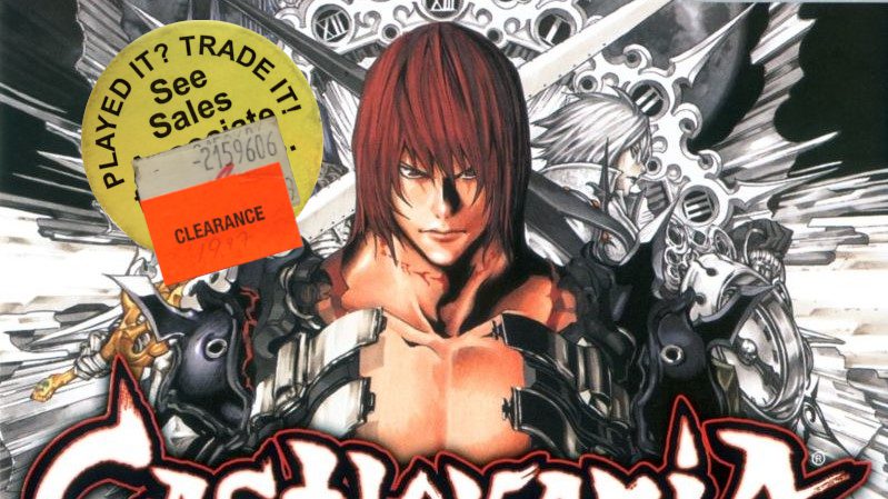
For Castlevania Judgment, Takeshi Obata was brought in, famous for the manga, Death Note. His vision for the characters was lots of bondage gear. Screw whatever era they were supposedly from, they wear leather with lots of zippers. Take a look at Maria Renard, for example, who is closer to her appearance in Castlevania: Rondo of Blood if she and Richter invaded Dracula’s BDSM club.
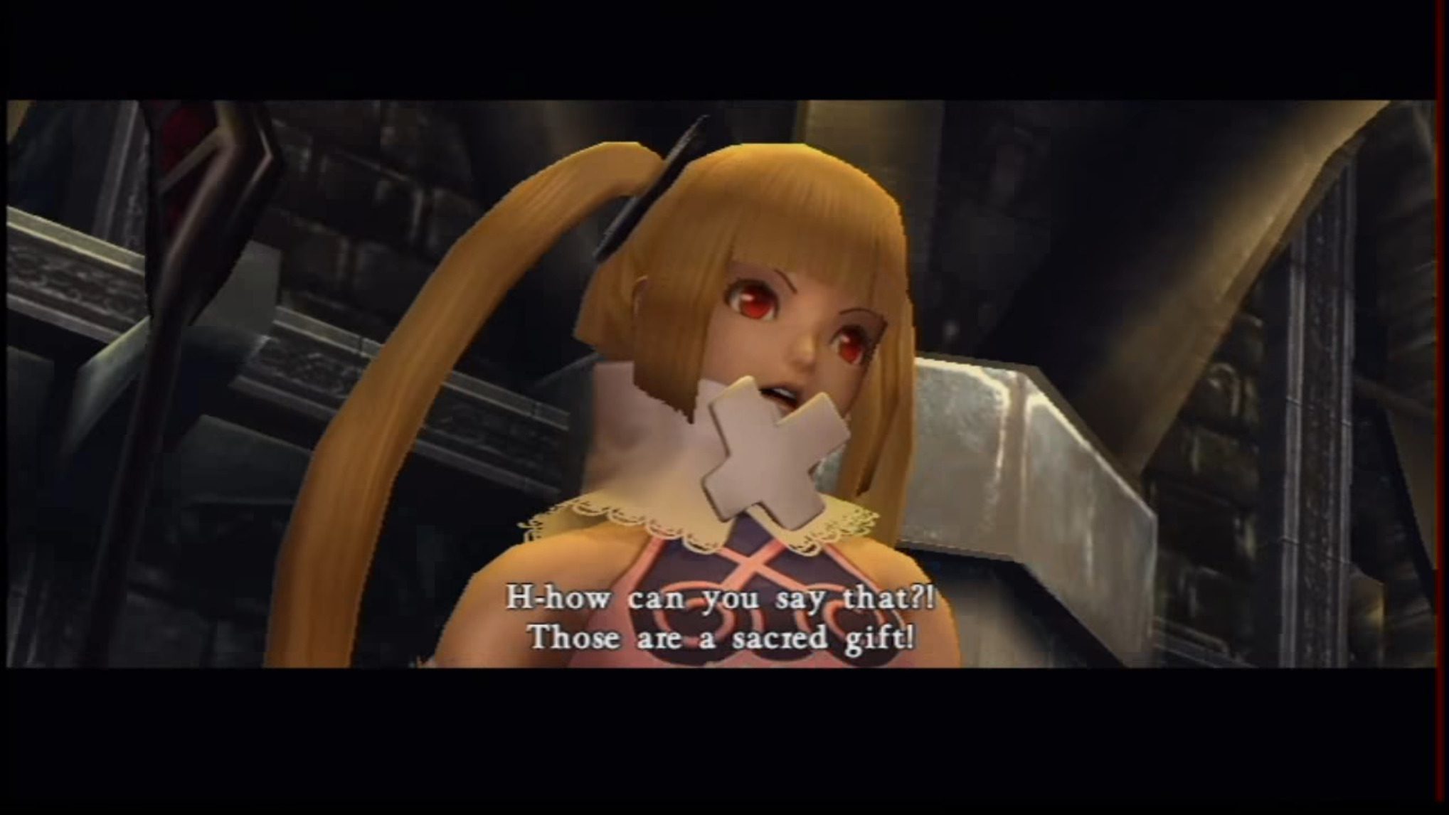
She’s dressed like a leather goth lolita, and her personality is weirdly vacuous. I mean, there’s child-like naivety, and then there’s tripping during your special attack. She also has an obsession with tits, expressing jealousy for how all the other female characters have heaping boobage. I get that this is a sort of a trope in anime for flat-chested girls, but I mean, Maria should probably just wait until puberty before she starts complaining. Wait, how old is she supposed to be. 15!? Whatever, she’s a late bloomer. Maybe she needs to learn the magic of a padded push-up bra like the rest of us. That leather is just going to bind them flat.
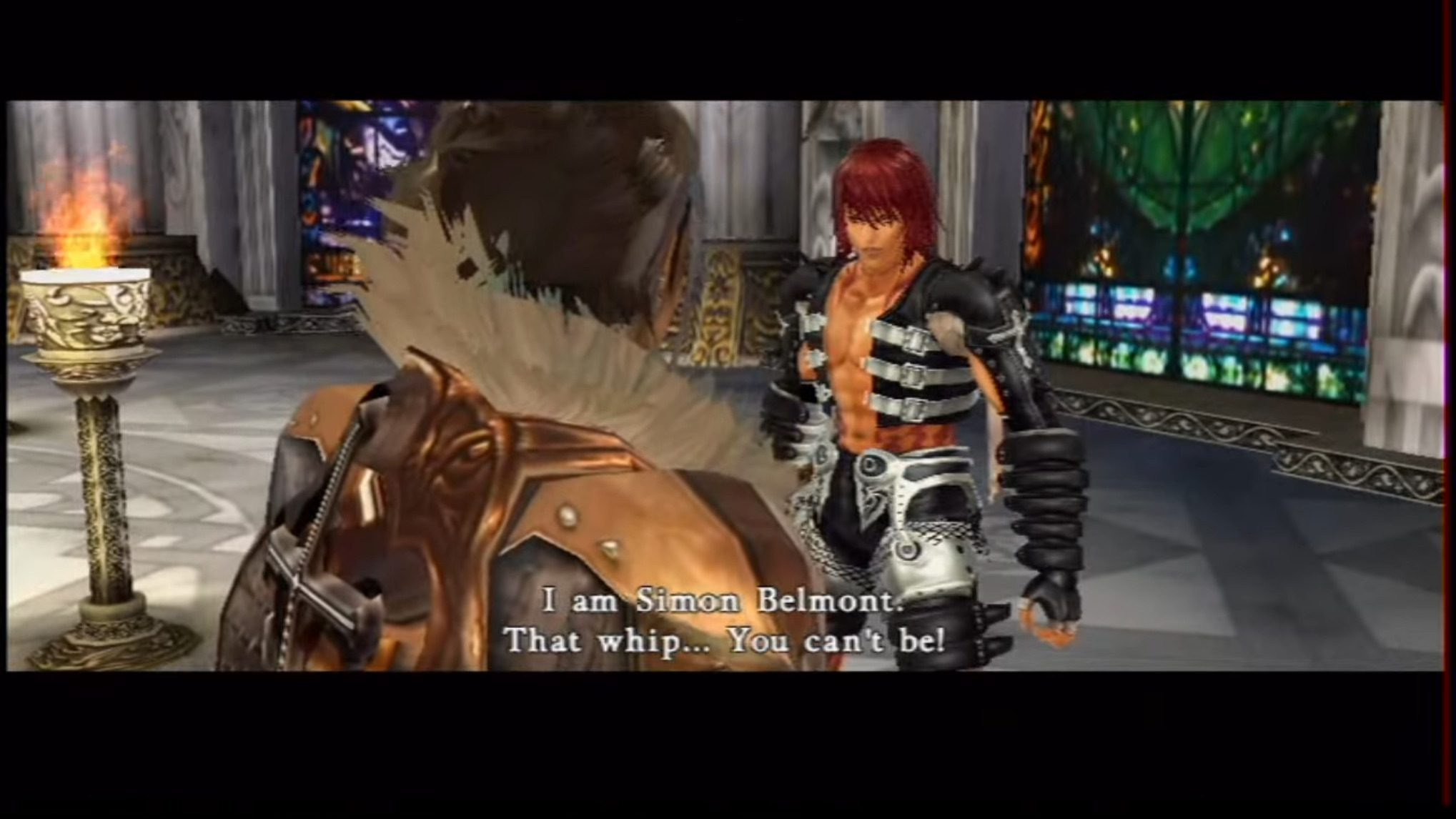
A few of the characters got off easy. Shanoa from Order of Ecclesia, for example, has a design that is closer to the one she rocked in that DS title. Sort of. She looks like a nun and wears garters over her pants, so…
Alucard is just sort of okay, Cornell (from Castlevania: Legacy of Darkness!?) is a bit excessive but not horrible, Sypha is… whatever. There’s obviously a lot of effort that went into their designs, but it just doesn’t fit the subject matter. Vampire hunters from across time? How about a bunch of zippers and buckles! Maybe if this was the sort of style that the series went with around the time that the protagonists started having actual faces, but it’s not. It just sort of clashes against the rest of the game that sticks more with the series aesthetic.
Their interactions are absolutely loony, as well. The characters loudly shout both their motivations and confusion at each other. They’re also like, “You’re this person of legend?” then decide they want to throw down anyway. I get it, it’s difficult to figure out why Trevor would fight Sypha. However, maybe if they came up with a more imaginative premise beyond “they’re stuck here, so I guess they’ll fight,” it could be explained.
The gameplay? It’s bad. It’s not Transformers: Beast Wars: Transmetals level of awful, but that doesn’t mean its passable. The idea behind Castlevania Judgment is that Igarashi wanted to incorporate motion controls into a Castlevania title, and thought that an adventure would be too tiring. That should probably put up some red flags right there.
So, I didn’t play it with motion controls because you can’t make me. I used a Wii Classic Controller, and you can kind of tell it wasn’t made for it. There’s one attack button, a button dedicated to throw items, and another button that I don’t think does anything at all unless you press it in conjunction with the attack button. You can block, which is sometimes necessary. There’s one dedicated to the special button which is all kinds of special.
You fill a gauge as you attack and defend, which is only used for your character’s super move and nothing else. This is a powerful attack that, if you land it, takes off roughly half of your opponent’s health gauge. That may sound like a decent finale, but you can pull one off early and the bar fills so quickly that it isn’t impossible to use it twice in a match. But think twice about doing that, because the sequences unleashed by these characters are so long that I wrote part of this article while waiting for them to conclude.
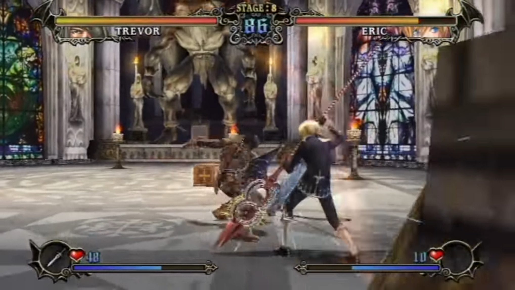
The camera is unlocked, which I think is to facilitate running around the levels and collecting hearts and items. However, Castlevania Judgment seems to want to be Soul Calibur so bad that you wish it had just settled for being a bad clone. The movement system is just so sloppy that it singlehandedly ruins any chance for real skill and strategy to be tied into the game.
It’s sad, because the game’s concept isn’t a bad one. I could absolutely dig a Castlevania fighting game if they did it justice, but the whole product feels like spit in the face. Did no one on the development team have an issue with the character design? Were they really so creatively void they couldn’t come up with a more interesting way of mashing the characters together? It lacks any real cohesion or vision.
The environments, for example, fit the Castlevania theme just fine. The soundtrack is absolutely phenomenal, though it is largely just made from remixes of the series’ best. Really, because it’s basically one big best of album. It’s generally what I turn to when I want some Castlevania music. It’s just too bad that it’s partnered with a sucky game. Castlevania Judgment is celery when I just want to drink the ranch.
I’ve played worse. The most painful part of Castlevania Judgment is what it does to the source material. Do you know what game did a better job of mashing up Castlevania characters? Castlevania: Harmony of Despair, and that’s partially because we don’t have to hear them talk to each other. You don’t need a reason to take all my toys and mash them together, I already do that in my head.
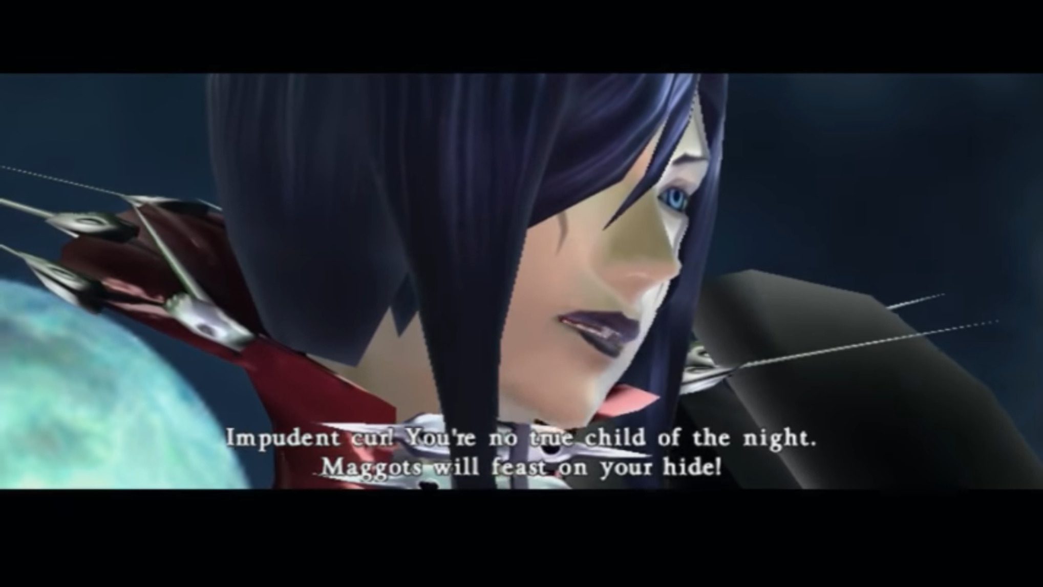
Castlevania Judgment is like when you ask for Frozen for Christmas, and your Grandparent gives you a bargain bin knockoff called something like “Freeze Sisters.” You might try to like it because of where it came from, but your disappointment sucks you into the depths of despair. Here’s Simon Belmont, but he’s wearing armored cargo shorts. Here’s Carmilla, but what do you mean you don’t recognize her? She was that mask boss in Castlevania 2: Simon’s Quest.
It’s just bizarre. I don’t know how someone can put so much effort into something so blatantly disappointing. This must be the frustration that all my teachers felt.
